Executive Summary
King Redolence Perfumes is a Nigerian luxury fragrance oil brand offering high-quality perfume oils across multiple size variants, from 10ml introductory bottles to 100ml collector editions. The brand positions itself as a premium alternative in a market where most local perfume businesses rely solely on Instagram pages, WhatsApp catalogues, or generic Shopify templates.
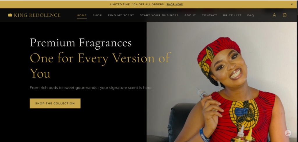
The brief was clear: build a website that does not look like it belongs to a local perfume vendor. It had to feel like Tom Ford. It had to feel like Chanel. It had to carry the weight of a luxury product without apologising for its price or its ambition.
Over two to four weeks, I designed and developed a full luxury e-commerce website, built on Antigravity, that included a branded storefront, individual product pages with full scent profiles, a multi-tier loyalty programme called The Reserve, a referral system, a Find My Scent discovery feature, a Start Your Business section for aspiring resellers, and a complete design system rooted in editorial restraint.
This case study documents not just what was built, but every significant decision made along the way, the alternatives considered, the problems solved, and what I would do differently if given the chance.
Project Snapshot
| Client | Mrs. Favour Chiemerie Ukandu |
| Brand | King Redolence Perfumes |
| Industry | Luxury Fragrance, Beauty, E-Commerce |
| Project Type | Brand Website, E-Commerce, UX Design, Loyalty System Design |
| My Role | Lead Designer, Brand Strategist, Web Developer, UX Consultant |
| Timeline | 2 to 4 weeks |
| Platform | Antigravity AI Website Builder, Netlify |
| Tools Used | Antigravity, Netlify, Supabase (scoped), Resend, Formspree, custom JavaScript via Intersection Observer API |
About the Client
Mrs. Favour Chiemerie Ukandu is the founder of King Redolence Perfumes, a Nigerian fragrance oil brand built on the belief that luxury scent should not be a foreign privilege. Her products are perfume oil interpretations of globally recognised fragrances, offering the same olfactory experience at a fraction of the designer price, in sizes that cater to both casual buyers and serious collectors.
Her customer base spans young professionals, gift buyers, and fragrance enthusiasts across Nigeria. Before this project, the brand had no dedicated website. Sales and inquiries were managed through social media and direct messaging, which created a ceiling on both perceived legitimacy and scalability.
The ambition she brought to this project was not small. She wanted a website that would make a first-time visitor feel they had landed somewhere that took its craft seriously.
Project Overview
The project was commissioned to elevate King Redolence from a social media vendor to a fully functioning luxury digital brand. Beyond simply putting products online, the goal was to architect an experience that communicated quality, exclusivity, and trust before a single product was viewed.
This required work across multiple disciplines simultaneously: brand direction, information architecture, UX strategy, UI execution, copywriting, technical implementation, and post-launch refinement. Every decision made on this project was filtered through one question: does this feel premium, or does it feel like we are trying?
The Challenge
The Nigerian e-commerce landscape has a trust deficit. Consumers have been conditioned to be suspicious of unfamiliar online stores because of past experiences with poor product quality, failed deliveries, and unresponsive vendors. Building a luxury brand website in this context means fighting two battles at once: communicating aspiration while simultaneously building trust.
The second challenge was technical. The client's products come in five size variants: 10ml, 20ml, 30ml, 50ml, and 100ml, each at a different price point, with a sitewide 10% discount applied across all orders. Most website builders present a single price per product. Displaying a single price for a product that actually comes in five sizes at five different prices creates an immediate UX problem: the customer does not know what they are actually paying, and that ambiguity kills conversion.
The third challenge was loyalty. The client wanted a collector's loyalty programme on the website, but there was no backend infrastructure in place to track individual customers or their purchase history. A static loyalty display that showed the same data to every visitor would actively damage trust rather than build it.
Each of these challenges required a solution that was both honest and premium.
Project Goals
The goals for this project were defined early and held constant throughout development.
The primary goal was to produce a website that felt genuinely luxury, not aspirationally luxury. The difference matters. Aspiring to luxury while falling short reads as pretentious. Achieving it reads as earned.
The secondary goal was to solve the multi-size pricing problem in a way that set accurate expectations before purchase without cluttering the product cards or undermining the editorial design.
The third goal was to build a loyalty programme architecture that was real enough to use immediately, honest about its current limitations, and designed to scale into a proper backend system without requiring a full redesign later.
The fourth goal was to give the brand a commercial layer beyond direct sales, specifically a "Start Your Business" section targeting aspiring fragrance resellers, turning the website into both a storefront and a lead generation engine.
Research and Discovery
Because this was a focused two-to-four week engagement rather than a full discovery sprint, research was rapid and directional rather than exhaustive.
The primary reference points were Tom Ford and Chanel, not because King Redolence is at that commercial scale, but because those brands execute editorial luxury online better than almost anyone else. Their websites are studied in silence, not rushed through. Text is sparse. Imagery carries weight. There is no noise.
Secondary research looked at how mid-market luxury perfume brands in the UK and UAE presented their products online, since Nigerian fragrance buyers are increasingly globally informed and expect to be treated accordingly.
The key insight from this research was that luxury websites do not explain themselves. They present. The copy is confident, not persuasive. The design creates desire through restraint, not through information density.
This insight shaped every subsequent decision on the project.
Strategy
The strategic frame for this project was simple: position King Redolence as the brand that Nigerian fragrance buyers did not know they were waiting for.
That meant treating every section of the website as a statement of intent. The homepage was not a product catalogue. It was an entrance. The shop section was not a grid of bottles and prices. It was a curated collection. The loyalty programme was not a points system. It was a membership.
This language shift from transactional to experiential was the single most important strategic decision made on this project. It informed the copy, the structure, the naming conventions, and the visual treatment across the entire site.
A secondary strategic decision was to build in commercial depth beyond direct sales. The "Start Your Business" section was designed to attract people who admired the brand and wanted to carry it, turning customers into potential distributors and creating a second revenue stream that the website could quietly support without ever looking like a wholesale portal.
Brand Direction
The design system was built on three foundational choices: a colour palette of Midnight Black (#0D0D0D) and Deep Gold (#C9A84C), an editorial typography pairing that balanced serif elegance with clean sans-serif legibility, and a content philosophy of deliberate restraint.
Midnight Black was chosen because it is the colour of luxury retail environments. High-end fragrance counters, premium packaging, and editorial fashion photography all default to near-black because it makes everything placed against it look intentional. Deep Gold was chosen because it reads as earned, not cheap. There is a significant visual difference between a bright yellow-gold and a muted, warm deep gold. The latter communicates heritage. The former communicates decoration.
The decision not to use a third accent colour, such as ivory or cream, was made mid-project after reviewing early builds. Adding a third colour introduced warmth that softened the premium edge. Keeping strictly to two colours maintained the tension between darkness and gold that luxury design requires.
This line, written for The Reserve loyalty section, became the tonal benchmark for all copy across the site. Every other sentence was tested against it.
Information Architecture
The site was structured around five primary navigation items: Home, Shop, Find My Scent, Start Your Business, About, and Contact, with a persistent Price List link added to reduce friction around the multi-size pricing question.
This structure was deliberately chosen over a more category-heavy architecture because the product range, while varied in size, is unified in brand. Splitting the navigation by collection, size, or price range would have introduced complexity that the brand had not yet earned the right to carry.
The "Find My Scent" section was one of the more considered IA decisions on the project. Fragrance is an intimate, personal category. Many buyers, particularly those newer to perfume oils, do not know what they want. A guided discovery path, rather than a search bar or a filter system, is more appropriate for a luxury context because it mirrors the experience of a boutique consultation rather than a database query.
The footer was structured to carry the operational information, including shipping and logistics, terms, and contact details, without pulling visual weight from the main experience. The decision to place "Message for full price list" as a WhatsApp-linked CTA in the footer rather than a static downloadable document was made to protect pricing flexibility and to create a direct line between the website and the client's sales conversation.
UX Decisions
Several UX decisions on this project required negotiation between luxury convention and practical Nigerian consumer behaviour.
The pricing disclaimer. Global luxury websites do not show prices prominently, or sometimes at all. But Nigerian consumers, particularly those who have experienced online shopping disappointment, want to know what they are getting into before they click. Hiding prices entirely would have created friction, not desire. The solution was to show the 10ml starting price on every card with a single line of contextual text beneath the section heading: "Prices shown are for 10ml. Click any image to view all sizes and prices." This preserved the clean card design while eliminating the ambiguity that kills conversion.
The Royal Collection carousel. The homepage carousel, showcasing hero fragrances from the collection, originally included "ADD +" buttons. This was replaced with "Shop" as the primary CTA, directing customers to the full product page rather than adding a specific size to cart without context. This decision was made because allowing a customer to add a product to cart without first understanding the size variants and pricing would create returns, complaints, and eroded trust, all of which are fatal for an early-stage luxury brand.
The Reserve loyalty programme. The original "Collectors Registry" section displayed static points data that was identical for every visitor because there was no backend tracking individual customers. This was identified as an active trust risk rather than a loyalty feature. The entire section was replaced with The Reserve, a properly designed loyalty architecture with four named tiers, a visual progress path, and honest copy directing customers to message directly to check their standing. The programme was designed to operate manually at current scale and to migrate to a Supabase-backed system when the business was ready.
UI Decisions
The visual execution of the site was guided by one principle: every element should earn its place.
The hero section was built with a crossfade carousel rather than a swipe or slide animation. This decision was deliberate. Swipes and slides are energetic. They suggest momentum and volume. A luxury fragrance brand needs stillness. The crossfade, combined with a subtle Ken Burns effect on each image, a slow, barely perceptible zoom and pan, gives the hero section cinematic weight without movement that reads as cheap or hurried.
The animation system across the rest of the site used a custom Intersection Observer implementation rather than a standard AOS library. The brief was specific: elements should snap into view as the user scrolls, fast and sharp like a reveal, not float in lazily. This distinction matters in a luxury context because sluggish entrance animations make a site feel heavy and outdated. The final implementation used a 0.3 second upward snap with a cubic-bezier easing curve that reads as precise rather than mechanical.
Product cards were kept deliberately minimal: image, collection label, product name, starting price, and a single CTA. No star ratings, no review counts, no urgency timers, no "only 3 left" messaging. These are conversion optimisation tactics that work in marketplace contexts and actively harm luxury positioning.
The Reserve section was designed with a vertical progress path using a slim gold line connecting the four tiers, The Introduction, The Selection, The Privilege, and The Patron. The naming convention was chosen to feel like a journey with status attached to each milestone rather than a points stamp card.
Technical Implementation
The site was built on Antigravity, an AI-assisted website builder, and deployed via Netlify. This combination was chosen because it allowed rapid iteration within a professional deployment pipeline, with the client able to review live changes on a staging URL before finalising any section.
Custom JavaScript was written to handle the animation system, since the default AOS (Animate on Scroll) library built into Antigravity produced entrance effects that were too slow and too soft for the brand's tone. The Intersection Observer API was used instead, with each element receiving a class on viewport entry that triggered the snap reveal animation via CSS transitions.
The multi-size pricing challenge was handled at the product page level rather than the card level. Each product page displays the full size and price matrix, allowing customers to select their preferred variant before adding to cart. This kept the browsing experience clean while preserving full pricing transparency at the point of decision.
For the loyalty programme, a Supabase architecture was scoped for future implementation, with email or phone number as the customer identifier, a purchases table tied to each identifier, and automatic point calculation based on confirmed order values. The current manual system, where customers message to check their standing, was designed to map directly onto this future structure so migration would require no redesign.
Responsive Design
The site was designed desktop-first given the client's primary audience and the nature of luxury retail browsing, but full mobile responsiveness was built and tested across standard breakpoints.
Special attention was given to the Royal Collection carousel on mobile, where card sizing and swipe behaviour needed to feel considered rather than squeezed. The hero section Ken Burns effect was adjusted for mobile to reduce motion intensity, since the effect that reads as subtle on a large screen can feel disorienting on a small one.
The Reserve section's vertical progress path was converted to a more compact stacked layout on mobile without losing the visual logic of the tier progression.
SEO Strategy
Given the two-to-four week timeline, SEO work was focused on foundational hygiene rather than a full content strategy.
Page titles and meta descriptions were written for all primary pages, with the homepage title and description positioning King Redolence clearly within the Nigerian luxury fragrance market. Product pages were structured with clean URLs and descriptive heading hierarchies.
The "Find My Scent" section creates a natural content depth that supports discoverability for intent-based searches, since users searching for specific fragrance profiles are likely to find relevant content within that section over time.
Long-form SEO content, a blog or fragrance journal, was identified as a future opportunity rather than a current priority, since the brand needed to establish its visual and commercial presence before adding content volume.
Performance Optimisation
Performance optimisation on Antigravity-deployed sites operates within the constraints of the platform, but several decisions were made to keep the site fast without sacrificing visual quality.
Images were compressed before upload, with particular attention paid to the hero section images since they load immediately on page entry and have the greatest impact on perceived performance.
The custom animation JavaScript was written to be non-blocking, initialising only after the page's core content had loaded. This ensured that the snap reveal animations enhanced the experience rather than delaying it.
The crossfade carousel in the hero was implemented with CSS transitions rather than JavaScript animation loops, keeping GPU usage low while maintaining smooth visual performance across devices.
Challenges During Development
The pricing display problem was the most persistent challenge on this project. The client sells five size variants at five price points, with a sitewide discount applied. Communicating this clearly without cluttering the design or confusing the customer required multiple iterations. Early versions tried to show a price range on each card, which created visual noise. A size selector dropdown was considered and rejected because it added interaction complexity at the browsing stage. The final solution, a single contextual disclaimer line per section, was arrived at after stepping back from the design and asking what the simplest honest communication of the situation would be.
The Collectors Registry replacement required both strategic and technical thinking. Removing a broken feature is straightforward. Replacing it with something that felt more premium than what it replaced, while being honest about the current absence of backend tracking, was harder. The Reserve went through several naming and structural iterations before landing on the four-tier named journey format. Earlier versions used language like "rewards" and "loyalty programme" which both read as transactional. The final language treats the programme as a membership with stages, which is closer to how luxury brands think about repeat customer relationships.
Maintaining luxury tone while solving Nigerian consumer UX problems created tension throughout the project. Global luxury web design is built for audiences who trust the brands they are visiting. Nigerian e-commerce UX often needs to address trust more explicitly. The solution was to be strategic about where each convention applied: editorial restraint in the visual design, contextual honesty in the copy, and clear operational information in the footer, where it supported trust without polluting the experience.
Results
The website launched as a fully functional luxury e-commerce storefront, representing a complete transformation from a social media-based business to a branded digital presence.
Key outcomes included a complete design system that the client can extend to future products and collections, a loyalty programme architecture that operates at current manual scale and is designed for backend integration when the business is ready, a secondary revenue pathway through the reseller section, and a pricing communication solution that sets accurate customer expectations without undermining the premium positioning.
The site also gave the client a professional URL and branded presence that can be referenced in all marketing materials, social profiles, and business development conversations, which is a foundational asset for a brand at this stage of growth.
Lessons Learned
The most important lesson from this project was that luxury is a communication problem before it is a design problem. The visual choices matter, but they only land if the thinking behind them is consistent. A beautiful homepage attached to confusing product pages, or an elegant loyalty section that shows fake data, does more damage than a simpler, honest website would have done.
The second lesson was about scope management in AI-assisted development. Working within a platform like Antigravity requires understanding where the platform's defaults work in your favour and where they need to be overridden. The animation system was the clearest example of this. The default was functional but wrong for the brand. Recognising that early and writing a custom solution saved the project from a visual mediocrity that would have been hard to articulate but immediately felt.
The third lesson was that client education is part of the deliverable. The client needed to understand why certain decisions were made, not just what was built. This was particularly true for the loyalty programme, where explaining the difference between a broken trust-damaging feature and an honest manually operated one required a conversation that was as strategic as it was technical.
Future Opportunities
The most significant future opportunity for this website is a proper backend integration. Supabase was scoped during the project and remains the recommended solution for connecting order data to customer identities, enabling The Reserve to operate automatically rather than manually.
A fragrance journal or content section would significantly improve the site's SEO performance over time and create a reason for customers to return between purchases.
An enhanced product discovery tool within "Find My Scent," potentially powered by a simple recommendation logic based on stated preferences, would deepen the experience and increase conversion from undecided browsers.
Finally, a dedicated reseller portal behind the "Start Your Business" section, with pricing tiers, minimum order information, and an application form, would formalise the business-to-business pathway the site currently hints at.
Skills Demonstrated
Brand strategy and positioning, luxury UX design, information architecture, editorial copywriting, custom JavaScript development, CSS animation, responsive web design, e-commerce UX, loyalty programme design, client communication and strategic consultation, AI-assisted web development, Netlify deployment, performance optimisation, and SEO foundations.
Final Reflection
King Redolence was the kind of project that required operating at multiple levels simultaneously: designer, strategist, developer, copywriter, and consultant, often within the same conversation with the client. The constraints were real, a lean timeline, a platform-based builder, no backend infrastructure, and a market context that pushes against luxury convention at almost every turn.
What made the project work was a refusal to compromise on the thinking even when the tools imposed limits. Every decision was made from a clear strategic position. The website that launched reflects that.
For a brand at this stage of growth, the website is not just a sales tool. It is the first proof that King Redolence is a real business with real ambition. That proof now exists.
Appendix
Brand Colour System
Midnight Black: #0D0D0D
Deep Gold: #C9A84C
The Reserve Tier Structure
10 Points: The Introduction. A complimentary 3ml fragrance, our selection.
30 Points: The Selection. A complimentary 3ml fragrance, your choice.
50 Points: The Privilege. A complimentary 6ml fragrance, your choice.
100 Points: The Patron. A complimentary 10ml fragrance, your choice, plus exclusive Patron pricing for life.
Product Size Variants
10ml, 20ml, 30ml, 50ml, 100ml
Sitewide Promotion
10% discount applied across all orders at time of launch.
Platform Stack
Antigravity (build), Netlify (deployment), Supabase (scoped for future backend), Resend (scoped for order notifications), Formspree (contact and inquiry forms)
Animation Specification
Intersection Observer API. Elements snap from invisible to visible with a 20px upward translation over 0.3 seconds. Easing: cubic-bezier(0.25, 0.46, 0.45, 0.94). Applied to all sections, headings, product cards, images, and buttons sitewide.
Case study prepared by Eunice Orji. All project details reflect actual work completed for King Redolence Perfumes.